Few can argue they started their career as successfully as Uno did.
Rostislav, his real name, began designing visuals in 2015 with covers for dBridge’s legendary Exit Records. He’s kept the bar high ever since.
Very early on, he developed his own style, proving that, with creativity and wit, minimalist art could be both interesting and beautiful. Having been a graduate of a design school, Uno’s approach is like a scientist’s, and that also means constant fearless experimentation. But it doesn’t stop there. The visual artist crafted not just covers, but also other formats like logos, posters, animations, or even merch.
Even though his minimal style became prominent, Rostislav kept challenging himself, approaching every project from a fresh angle, looking for more expressive ways of picturing the music. This helped him get recognition from the more experimental side of the drum & bass scene. In fact, the artist has collaborated with the most respected imprints of the genre, such as VISION Recordings and Critical Music, or DIVIDID. The designer has already created artwork for Current Value, Mefjus, Noisia, and Enei, to name a few.
As part of this new interview series dedicated to talented visual artists of the scene, I sat down with my good friend Rostislav to learn more about his background, his artistic process, his inspirations, and many more interesting topics I’ll share with you below.
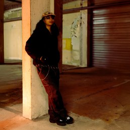
But before we dive into the interview, please enjoy these three exclusive artworks Uno shared with us. Two of them are d&b-inspired artworks that he sent to dBridge back in 2015, and the third is one of his never-published sketches.
Enjoy!

What do you prefer to be called: an artist or a designer?
Both options are fine. Before, I called myself only a designer, because the type of my activity still has a certain applied character: covers, as a genre, in one of the first stages perform an advertising function, and I have to work with the expectations of the customer anyway. Also, I studied to be a designer (in the NRU HSE Design School by the way). But at some point, I doubted this status, after all, I have some more freedom than being a designer in most other industries where the phrase “designer solves the problem” is relevant.
My task is to make a nice image, and this is the vaguest definition, within which I can and want to look for some new opportunities for self-realization, first of all. The presence of this limitation does not make me an artist, maybe, but I no longer perceive myself as a purely designer. I’m somewhere in between. That’s why I changed my full nickname from uno design to uno.graphics.
When did you start listening to electronic music and drum & bass in particular?
I got into electronic music in 2010, particularly Royksopp and Deadmau5. Back then I was a schoolboy and listened to their discographies on repeat. Drum & bass started for me in 2012 with Noisia and the ‘Neosignal’ label. You were the one that got me into Noisia by the way, posted their releases, if you remember. I was impressed by the track “Phace & Misanthrop – Energie”, so I checked the whole Neosignal discography.
What interests you most about visual art?
Now, I am trying to formulate for myself what the spectrum of the visual consists of. I used to be interested in specific areas: plasticity of lines and forms, composition, plot and metaphors, and typography. Recently I was interested in color, or rather its interactions in various conditions (I started reading Josef Albers lol).
Now, I want to look at the full set of these components. I’m only looking for now, fixing my findings. With each new entry, I find out that each of these in the content still has endless spectra, which I also want to somehow classify
To the readers: if you know useful literature, I would be glad to read it. Thank you in advance :3
When was the first time you saw the close connection between visual art and music?
I cannot say exactly. There are several preconditions. It could be when I saw ISAM Live in 2011. I was very impressed by the synergy of music and visuals.
It could be when I read the comment «cover is a fucking lie» regarding a drum & bass track and I tried to understand the point of this comment (by the way, that cover was really a lie. The track sounded different). Or maybe it formed itself somehow, I drew a lot at school and listened to music a lot, and often did it at the same time.
When you started to draw regularly, what were your first serious works?
Sometime around 2012–2013 on VK [Russian social network – ed.] and Deviantart, I posted minimalist works under the nickname “thp”, designing them in a manner mimicking music releases. I had a single and even an album! I deleted everything on VK, but the fate of Deviantart is not known to me.
As far as I know, your first covers were made for Exit Records, and this can be called a very successful start. How did it happen?
In the summer of 2015, I set myself a challenge: to make minimalist Exit-style covers every day. But it didn’t last more than a week. I sent the results to Dbridge, not really expecting anything. He suddenly replied. He asked me to make a cover, based on one of my artworks, for the forthcoming Module Eight album. In the process of work, I was asked if I could make another cover, for a Skeptical EP. And my career began, so to speak.

Why did you come up with the nickname uno?
Before I had the nickname “thp”. It meant “Tann-Hess Production”. Tann-Hess is my even earlier nickname. Don’t remember what it meant. I guess that’s what I called my character in the sonic universe, lol. I didn’t like the nickname thp, the phoneme didn’t really reflect what I was doing then.
After the first Exit covers (which I signed with my real name), a little story happened. Somewhere around the end of 2015, we wanted to rename the group ‘The Upbeats & Co.’ [on VK]. It became ‘seequench’, but one of the options I suggested was uno. I was probably under the impression of ENA, I liked his laconic nickname. So, since ‘uno’ was not used, I decided to take it myself. The nickname is concise, the phoneme is pleasant, and back then I liked kinda minimal concepts: a dot, the one, and stuff like that. And my work was basically minimalistic back then. Everything fell into place and I realized that this nickname suited me.
I didn’t think about the logo for a long time. I liked Helvetica and I just wrote uno using it, changing only tracking. I didn’t want to add anything, and I still don’t really want to.
Can you name your sources of inspiration? What influenced your style the most?
First of all, my style was influenced by early Neosignal covers, including ‘Greed of Gain”. I am attracted by the restraint constancy, and simplicity in their design. For the same reasons, I was attracted to the Swiss poster. I became interested in this direction when I began to be more curious about design. I was attracted by the ideas of Joseph Müller-Brockmann, reading his “Modular Systems” quite early, I was flattered that I came up with some of those ideas even before reading this book. Of course, I was inspired by constructivism and suprematism, both visually and conceptually.

Constructivism and suprematism interested you when you were studying at the university? Many people liked the poster you drew for the concert at the White Tower. I don’t think anyone else would have thought of this. Do you have any favorite constructivist buildings?
Thank you. I appreciate that. The idea for the poster came rather quickly (which is why I think anyone with the practice of coming up with graphic metaphors could get to it), and I fiddled more with its implementation. Suprematism interested me before the university, I can’t even remember when. Constructivism interested me when I was studying at the uni, I was at the exhibition at MAMM, and Rodchenko’s works were there.
I’m not that deep into architectural constructivism, I like this direction in graphics (again Rodchenko or, for example, Tatlin’s compositions, I am attracted by the idea of the primacy of the material in his works). So, it is difficult for me to single out some favorite buildings, because not very interested.

Are there any main principles that you stick to?
I think my early work can be directly attributed to minimalism. What I’ve been doing lately, in fact, also works on the principle of “the minimum necessary”. I’m not a big fan of overcomplicating my work. Even the fonts I use are the poppiest — Helvetica and Montserrat. I’m okay with them because they work.
I also try to build everything on grids based on ratios of 1/3 or 1/4 of the canvas. I have prepared templates for covers with a grid that takes into account both ratios.
Can you name your idols and favorite works in design? Specifically, in the music industry.
I really love the “Studio Hypgnosis”. Their work inspires me to look for what can be done with the cover as a format. One of the significant works for me is a cover of Peter Gabriel’s self-titled album. The work with layers is priceless. It seriously takes into account the material of the envelope.

Also the cover of XTC “Go 2”. It is just text, but the deconstruction that occurs in its content makes it an ideal cover.
")
I also like Supersuper’s art for the label The North Quarter, works of Tom Jager and Former. The latter’s cover for Maere “Contrasts” is one of my favorites. The idea of “contrast” here is very witty, and the work with materials is excellent.

Your own best works, in your opinion?
First of all, those in which I somehow interestingly worked with the format. For example, the “Bop – Patterns I Have Known And Loved” where I used a phoenicistoscope for vinyl stickers. If you use a 30hz light or a 30 FPS camera, you can see animations on the vinyl stickers. I also like “Blackpocket – Alayly”, where I managed to create scanimation with two layers of cover.

I really like my latest works, “Julian Tonkin – Motion Sickness” and “Enei – The Greatest Trick”. In them, I gradually tried to go beyond my own style and, as I see it, it turned out very well.

I noticed that you only post works created for other people’s projects. Do you ever draw for yourself?
Of course, I do. I’m just not used to posting it publicly, only share with friends. I experiment more than I do something ready for myself. I use my Instagram as a portfolio of commercial works, and only recently I thought that I could use it to post my own works. Still thinking of how to realize it. I post some things as stories.
How do you get ideas for a design?
Most often I listen to a track and try to imagine images or plots, based on the sound. With this in mind, I try to fit the titles. Sometimes it’s vice versa. Other times, I work only with the title or only with the sound.
I start with sketches on paper: sketching figures, silhouettes, and overall composition. The result is 5-8 pieces, of which 3-4 options often survive to the stage of digital drafts.
What drawing tools do you use?
Affinity designer for vector graphics and layout. Photoshop for compositing and processing. Blender for 3D. After Effects for animation. Lately, I’ve been trying to do compositing there as well.
In many of your works, there is not only beautiful graphics but also some kind of plot. How important is it to you? Do you attach great importance to it in other people’s work?
I used to. I was very concerned about the question “What will the cover be about?” Somehow I saw this as the basis of the work and its value. Now I have somehow revised my view on this. I look for other ways to set the basis for my work.
Can you tell an interesting backstory about any of your covers or some other work?
I really like the cover of “Black Barrel – Cancelled”. He asked me to take the inscription CANCELLED from the scan of his visa and do something with it. I looked at the scan and realized that it already looked like a great cover. Why change anything? It was only necessary to clean up the scan, and change the numbers so I wouldn’t get fucked up, which I did.

Do you have a cover with a hidden meaning/message that no one has revealed yet?
I guess Abis once said that all my covers for DIVIDID ( their first 8 releases) have some hidden message that no one has revealed. I wouldn’t call it really a message, it’s rather an interesting detail, passing through the whole series.
A tip: take a close look at the dots on the cover of The Wall / If U remixes.

You have worked on many different formats: not only drawing covers, but also logos, posters, animations, merch, and even book designs. Which format is the most interesting for you?
It’s still the covers. There was a time when I didn’t take the genre very seriously even though I worked in it. Now I am more and more delving into its history and structure and this direction appears to me from unexpected sides. Of course, the covers do not have such variability as, for example, the posters. They are attached to the music (the poster is more variable: cinema, events, social posters… you don’t have to tie to anything at all) and to the format 1:1, at least in digital. Thankfully, there is more creative freedom while working with the physical format: you always need to design a tracklist, and you can make liners or reversals in some cases. You can play with the outer layer of the cover, vinyl stickers, cutouts, etc. Cassettes are not tied to a 1:1 format.
You interact with physical covers one way or another: at least you hold an envelope/box in your hands. You also need to get a disc/record/cassette out of there. Here you can work both with these components and with the interaction experience itself, even at the level of contrasts. In physical format, an interesting field for expanding the cover’s narrative, for me, is promo videos and teasers. I am also interested in making logos, posters, and merch, but the covers are somehow more familiar. As for books, I made them for the university. This format, of course, is very rich in opportunities for experimentation, but it didn’t really hook me.
In addition to the usual covers, you created animated versions of them. For example, for a whole series of Mefjus releases. How much more difficult is it to imagine and create videos compared to images?
The stuff for Mefjus was not very difficult, but it was long to make. In fact, everything was simple. Particles should move in some direction, you can imagine the direction already from the static cover. And since I save all the layers in the process of work, throwing them into after effects and animating them properly afterwards was not very difficult.
It’s more of a mechanical job, where the problem is rather the render time than the ideas and the implementation. Although I am interested in this area, here I am also looking for unusual ways of revealing a static image through animation.

You may know that the annual Drum&BassArena Awards added a nomination for “Best Cover” a couple of years ago. Despite your productivity and fresh ideas, your work was not even on the list of nominees for the past two years. What do you think about this award and any awards for designers? Have you seen the covers that won in this category?
I like the idea of this kind of award, because they bring to the surface the discourse about covers in the industry. Specifically about the D&BArena awards — this is a popular vote, first of all. That’s how we can conclude which covers worked for a large audience.
And from this position, it’s nice to know that the cover of “Halogenix – Dragonforce” (created by Bertie Simpson) from 2020 received the prize. This is strong work. The other artworks were also good. I liked the cover of “Pola & Bryson – Beneath The Surface” (created by Army Of Few).

But, to be honest, I would like to see in the nominations the works of the already mentioned SuperSuper, or the Sofa Sound covers. I think this will be possible at awards of a different format.
You curated the visual part of the charity compilation ‘Together With Ukraine’. There are 33 artworks in total but I noticed that many of them apparently have nothing to do with Ukraine.
Initially, I requested artworks on any subject. The principle was the same as with the [compilation] tracks — to share your creative work to support the release. It was not necessary to tie it to the [compilation’s] theme
Does your own artwork have no narrative?
I drew it one year ago, under the impression of Susumu Hirasawa. There is obviously a plot, but it was inspired by the feel of the music. Now there is a different interpretation associated with the current situation. And, although I didn’t imply it initially, this additional meaning, imposed purely by the context, seemed to me appropriate and interesting.

Who was the most interesting actor to collaborate with? Do you dream of collaborating with some label or music producer? Or another visual artist?
I liked the ideas that Bop was giving me when we were actively collaborating. I dream of working with Ryuichi Sakamoto, Oneohtrix [point never], [Amon] Tobin, and Susumu Hirasawa. Right now I’m preparing fan artworks to share with them. Might work as it did with Dbridge. If it doesn’t, I’ll just post them on my page.
The visual artist I’d like to work with is Tom Jager. I like his style. Should’ve messaged him already.
How long have you been working on your longest project?
I guess it’s the cover for “Synergy – Intervals”. It took 4 months in total. 2 months to come up with an idea, a month to implement it, and a month to create a video.

Have you ever had a bad experience while working on a project? Any canceled drawings?
There were two cases with the label Methlab. The first was when I did Universe Breeze for the Synergy single. Jeff didn’t like the drafts and sort of started looking for another designer. The release never came out.
The second was the cover of “Abstract Elements – Tenderness” EP. There was a very fun version with a rose, me and the guys liked it. But Jeff rejected it. He said it was too much. Instead, Yulia Kvasova and I made something like a manga excerpt.
Has there ever been a case when you drew something for music that you didn’t really like? How did you cope?
It happened, yes. Before, I tried to somehow put myself through this. But it doesn’t really work, to be honest. Now, if this happens, I look for other clues in the release, often the titles really help.
You had a great portfolio site. Where did it go?
Thank you. The site was made on the Readymag platform. It has a not-very-pleasant pricing policy, which is getting worse and worse every year. And it would be okay, but the site worked very slowly, on some systems it didn’t load at all. In parallel with this, I thought about redesigning it for about a year and a half and put a lot of effort into it.
But when one of the customers in Discord tried to open my site and it simply didn’t work out due to Readymag’s poor engine optimization (which I had no control over), I decided it wasn’t worth it. And when my subscription expired, I decided not to renew it, but simply redirect the domain to my Instagram. Life became easier.
You said earlier that you were going to try VJing. Are you still interested in this venture?
Yes, but I can’t get around to it. I’m interested in this area because when I saw Isam’s live, it pushed me to start doing graphics. And I’ve been wanting to do something like this for years. But it turns out I get swamped by work and everyday life. and I don’t have time to learn it. It sucks, of course, but what can you do.
Would you like to add something?
Well, I guess there’s nothing more to say. The questions were very comprehensive :D. It was actually quite exciting answering them, thanks!
Interview conducted in early 2022
Thanks so much to Uno for the great conversation. Don’t forget to follow him on socials and to support his work.
You can check more interviews from visual artists like our past talk with exciting TouchDesigner talent DeRe.
uno.graphics
Instagram